Increasing the Your Run Engagement Rate - UX Case Study
Your Run is a community platform for runners, where they can track their performance of running events. The app allows you to keep track of the events you would like to participate or participated in, track the distance and time of your run and compare the results with results from others by means of leaderboards.
My role
UX Research, UI / UX Design
Team
Janice Ibe
Duration
Two months
Tools
Figma
The business problem
The current engagement rate of users with the product is not high enough for generating the desired page impressions.
The goal
Implement features that increase the engagement rate of the app in order to attract more potential customers for advertising.
User Research
Before starting the user research as part of the design process I set clear goals on necessary information that could add value to strong and aligned UI/UX design decisions. Based on this, I choose to conduct three in-depth user interviews with 5 existing Your Run users. Carefully formulated questions were used in order to reach the set goals. Besides, I also made use of available customer support logs and app analytics. These were analyzed for deeper understanding of the current users.
The creation of several categories and color-coding helped into finding common patterns, behaviors, characteristics, needs and wants. Additionally, this helped into gaining clear insights into user problems. The first user problem was slight frustration linked to the availability to “sign-in” for running events on the app, however the official registration for the event must be completed on another platform which was defined inefficient. The second pain point recognized was linked to social aspects. This involved easy accessible advice, tips, inspiration and comparing with others.
Personas and User Journey
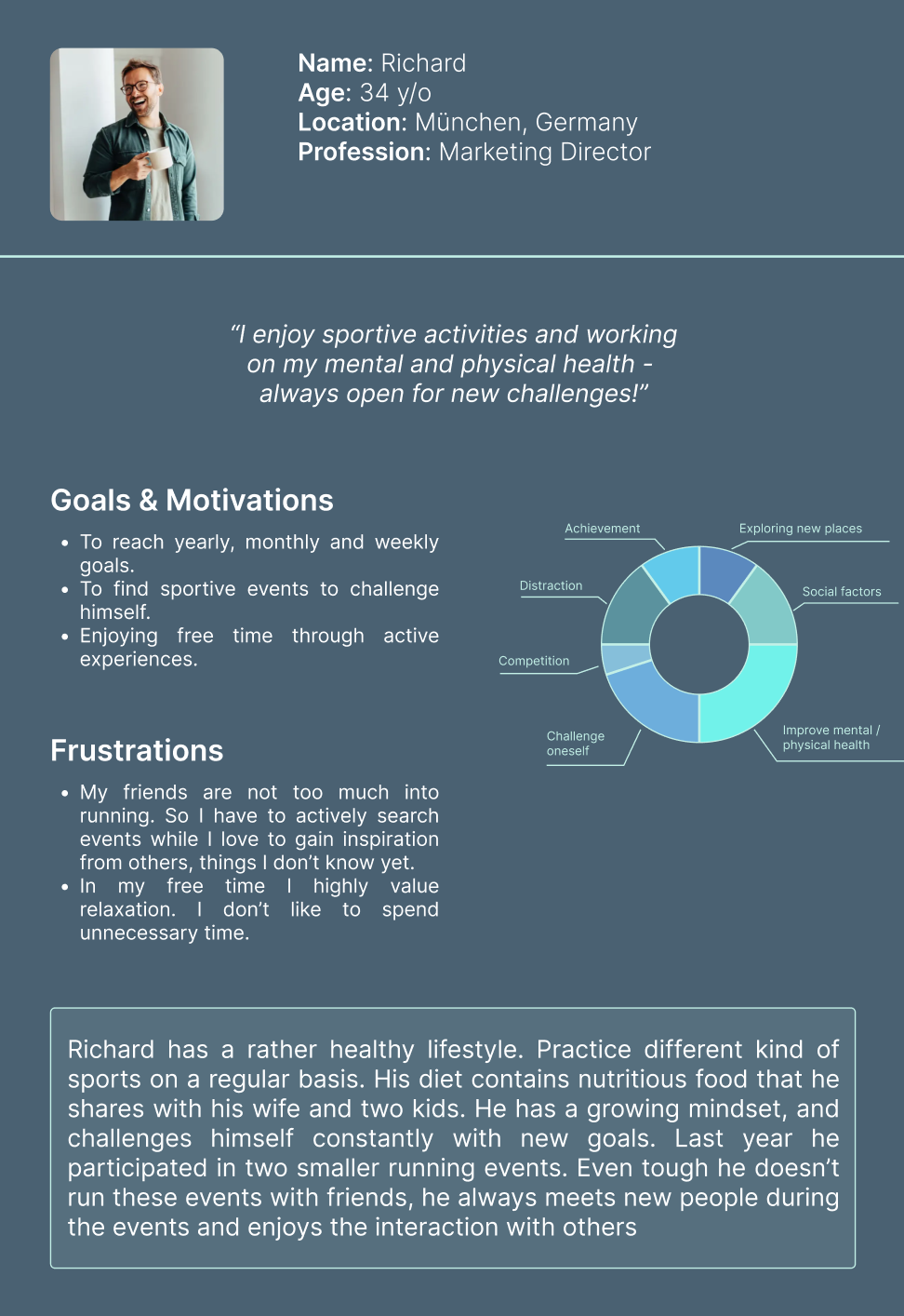
Based on the findings, I would like to introduce you to Richard and Fabian. Your Run user personas created from common themes within the gathered data. Through color coding I gained clear insights into diverse themes, and funneled these down into two categories that I translated into the personas to be seen below.
Based on the personas and journey mapping, the exact pain point had been highlighted. These led to clear and usable improvement opportunities for further design and concept creation decisions. The journey map shows highlighted tasks, which were identified as pain points in line with the use of Your Run. The first one is gaining advice/tips from people within the community. As the users are all part of this specific community, it opens a great opportunity to give them the possibility to share knowledge and thoughts about specific events. The second one is the increase in motivation to complete the running event successfully. This feeling can be strengthened through sharing your news with others, as this is proven to boost one’s motivation according C. Meyers (2021). Finally, sharing your process with family / friends / community members and tracking not only your event results, but also the improvements during your preparation period are leading to the opportunity to provide a place of sharing and tracking more elements part of the event running journey.
Key design decisions
1. The interactivity of the product should be increased in line with the improvement of possible social connection and interaction in the product.
2. New additional product features could include sharing news, updates, highlight, advice and / or results.
“Fabian is an ambitious student who needs social interaction with people within the community during all phases of the running event journey because it will motivate him to perform better.”
— User Problem Statement
Ideation
My favorite part of this project was the ideation phase. Brainstorming about possible solutions and getting closer to the ideal end result. I started with writing down as many as possible options that could positively influence the problem. I sketched high potential ideas and prioritized features based on the needs of the users and business. At this point, the developer and product owner took part in an extensive meeting to minimize biases and to be able to proceed with one solution the product owners agreed on. What feature will be added to the product in order to increase social interaction and the engagement rate? A Your Run Feed. In this way users will be able to share posts with advice, tips, questions and/or preparation linked to a specific event. All (public) posts shall be visible on the feed open for interaction.
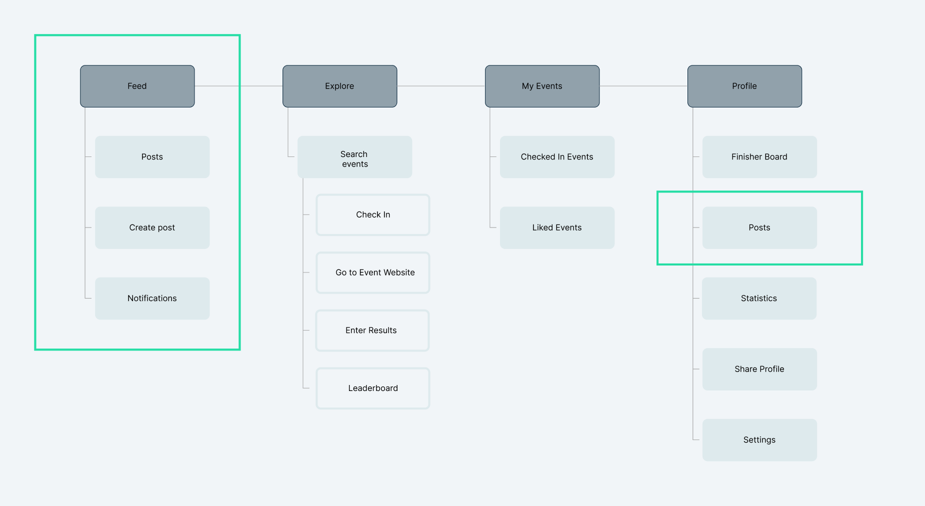
The product is already existing and therefore will be adjusted in user flow and information architecture. In order to gain a better overview of the total end product by implementing the feed, I created the user flow specifically related to the feed. Additionally I mapped the information architecture of the product with a highlight on the new addition within the product. The feed section will be a completely new, while only elements will be added to the profile section that already existed in the product.
Design Process
Because the product already exists, the used style is consistently implemented into the further design. Before prototyping I created elements and components that would become part of the new feature, necessary for the final prototype. The unique value proposition of the product is the database of all running events. In order to strengthen this with the addition of the new feature, I chose a variation of seven types of posts, which all will be linked to a specific event from the database. After that I started with the creation of mockups that eventually were used for an interactive prototype of the final solution.

Prototype
Final Solution
-
The final solution to solve the business as well as user problem is the implementation a feed. With the addition of this feature, users will be able to higher their social interactions by sharing personal milestones with like minded people, gaining advice or ask question for example. Besides, they have more possibilities to track not only their final running results but also their journey towards this end result. On the other hand, for the business, users making more and time of the existing product increases the position on the market in possible collaboraions.
-
This project was a great learning experience. One of the biggest challenges was the need to sometimes discuss / brainstorm with teammates, while this was an individual project. Instead I learned a lot from online sources such as Youtube and blogs on Medium. I am also thankful for the open communication with the developer and product owner when necessary. I strongly believe working together, and so being able to view different perspectives will lead to a stronger result. This project also showed me again the importance of testing the idea to minimize final user frustration.
Results
After the implementation of the new product feature, analytics showed clear difference. Based on the KPI ‘number of ads impressions’ data showed that these increase more than double. The number of downloads and users also increased during this time. However, after two months the numbers also seemed to drop back. For further studies, it would be interesting to investigate how the drop can be minimized and rather turned into further growth.
JIBES UI UX DESIGN
This case study is created and executed by Janice Ibe. Someone who is ambitious and creative, often inspired by elements of nature and adventure. Would you like to know more about the designer or contact details? Click on the button below.


