OMF App - UI / UX Case Study
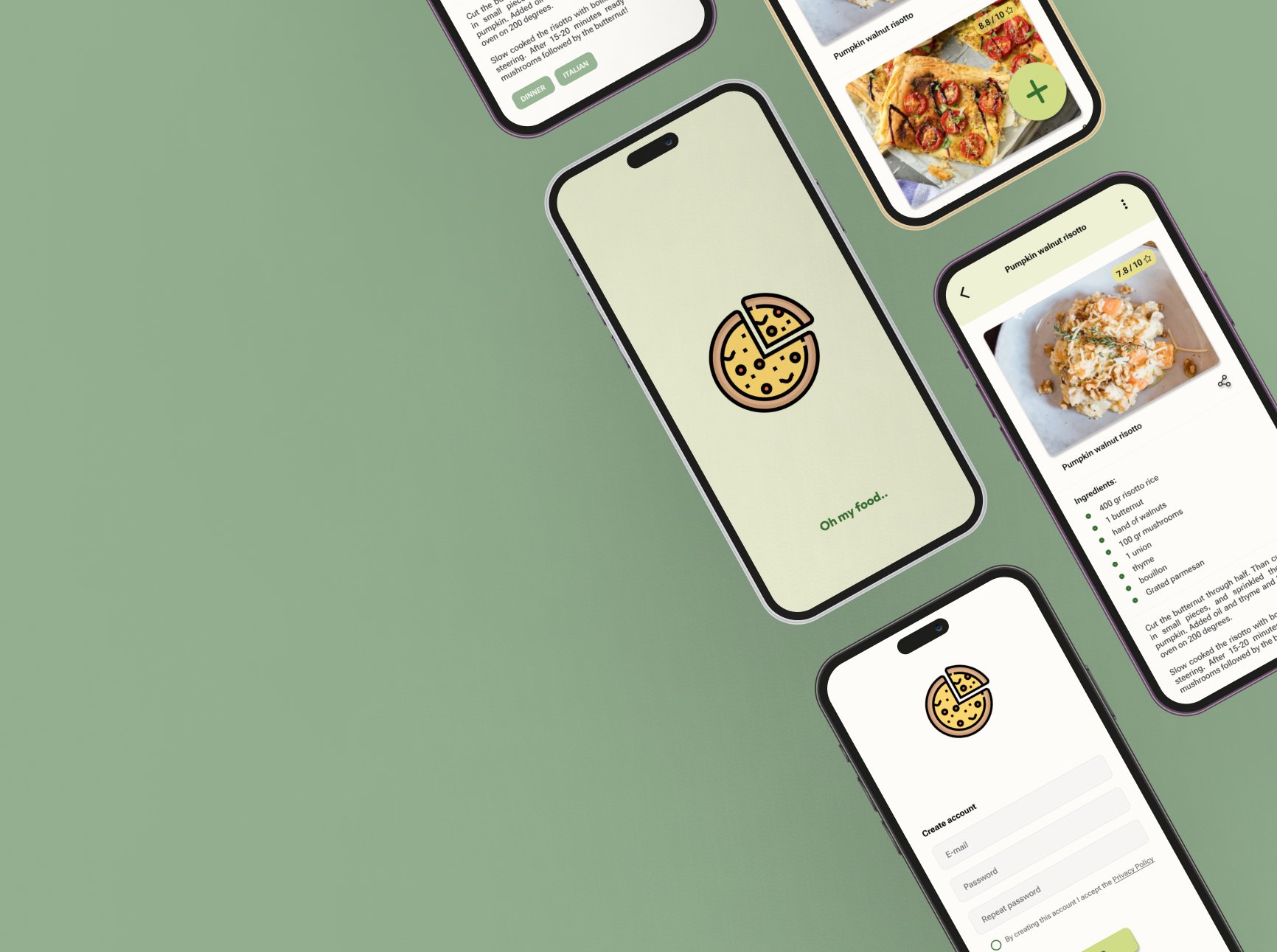
OMF “Oh My Food” is an experimental project to showcase skills regarding UI / UX design. The algorithm on social platforms such as Tik Tok often show videos from recipe creators because of personal interest in cooking. While observing their way of sharing recipes and responses from their community, I recognized a problem which will be thoroughly explored. There are already several recipe apps and websites, these will be further explored as well in the research phase. The objective is to create an minimum viable product to support social media recipe creators in sharing and saving all of their recipes.
My Role
UX Research, UI / UX Design
Team
Janice Ibe
Duration
Two weeks
Tools
Figma
The User and Their Problem
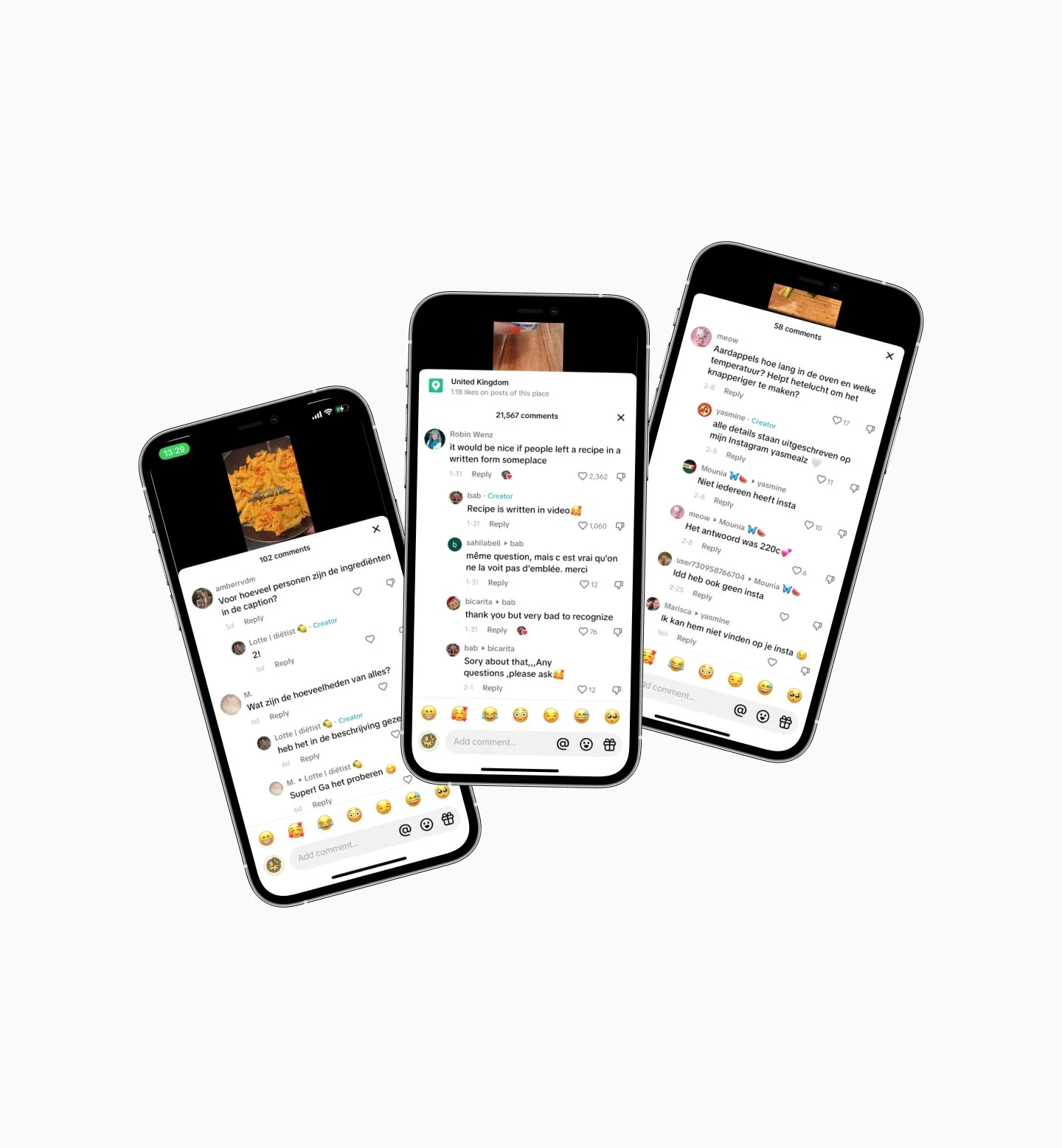
In order to learn more about the target group, I made use of the qualitative research method. I set clear goals and created a form with specific topics that I used to go over more than twenty observation sessions on social media platforms. I watched posts from content creators with the focus on recipe sharing. With the set goals in mind, I tried to ask questions to several creators though commenting or sending direct messages. However, this was very challenge because the response rate was very low. Fortunately, the observations gave a lot of insights.
First of all, for all recipe content creators the commenting section of their posts almost always involved a lot of questions regarding the recipe, whether to share the recipe or more details because of “unclear” communication regarding the recipe. A distinction can be made between creators who shared their recipes directly in the videos through text and/or voice. Another group of creators shared their recipes in the caption of their content or in the comment section. The smallest group referred their viewers to another page or platform.
In the comment section it was clearly visible any type of recipe creator, received a lot of question regarding the recipe. Frustrations, or at least lack of clarity, as well as positive reactions were observed. Even though I didn’t count the very exact numbers of comments, a trend was recognized for each type of recipe sharing.
The highest frustration and lack of clarity on recipe details was observed in the recipe content where creators forwarded their viewers to another page or platform that would contain the specific recipe details. In some cases, this was very accessible, which caused lower frustration. However, when the accessibility was low, this was perceived to cause the highest frustration. This is followed by recipes in video, a clear recipe overview or specific details were not completely communicated or hard to access. The least frustration was observed at recipe creators who made used of written recipes in caption, which was recognized on a higher amount of comments about happy results. The major problem in the last category seemed specific details that were forgotten or not communicated.
Market Research
There are already several recipe products on the market with a variety of features. In order to learn more about existing products, features, needs and wants I conducted a competitive audit in excel. Overall themes and highlights can be found in the image above from a few of the existing products. These are all indirect competitors, as I couldn’t find a product that focusses specifically on recipe content creators, which is positive for the unique value proposition.
Personas and User Journey
Let me introduce you to Emma and Lisa. Based on all findings I created the user journey and two personas, that clearly show two type of recipe content creators to be kept in mind during further design decisions.
-
Lisa is 28 years old and lives in Utrecht. She is all about food and fashion, which she shares about on her social media profiles. Her favorites are Instagram and Pinterest. She started posting already 12 years ago on unregular basis, however since the last 4 years she post more consistent basis.“Cooking and creating content feel as such a relaxing activity for me”
Pain point: it’s so important to me to maintain this as hobby, not an obligation.
Goal: it would be a big milestone to get a paid partnership one day.
-
Emma is 21 years old and learned about cooking already at a very young age, when she got inspired by her mom. They used to harvest a lot of vegetables and fruit, which became a foundation in the daily recipes - healthy and organic. Since she was 18 she shared at least two recipes each week on her social channels such as Youtube, Instagram and TikTok.
“Healthy food is the start of a healthy life”
Pain point: while my audience keeps growing, I get more difficulties managing my time schedule.
Goal: I think it would be perfect to start or work in a bed and breakfast, where I can meet a lot of different people and inspire them with healthy recipes and ingredients.
Based on all findings so far, clear insights have been gained into pain points and therefore a direction towards potential solutions. These will be further explored in the next phase. The user problem statement will be defined as the following:
“Recipe content creators love to cook and create their own recipes either for fun or with ambitious goals who need a product that will help them to easily implement the recipe in a clear way into their content because it will bring more clarity to their followers. ”
Ideation
The set goal for the final solution is finding the perfect balance between existing products and the elaborated target group. There already exist plenty products connected to cooking and recipe creation or saving. However, the focus on recipe creators didn’t show any results so far. When combined with specific features, this can be turned in an unique value proposition. In order to explore potential ideas, I started to list all possible feature, based on earlier finding and variations supporting the target users problem. Using the action priority matrix while keeping the goal in mind, the components of a possible final solution started to take shape. Two key features to stay in line with the goal involve the ability to create your own recipe and share this in a possibly aesthetic and / or personal way.
To see how users could reach their goals, I created a user flow that show the interactions necessary to reach the goal linked to the two key features. After that, I linked a first set of sketched wireframes to show paths between pages. The images below show the described user flow and information architecture.
Design
Looking at existing products and diving into color psychology, I gained inspiration for the design and branding of this product. Most food related products make use of the colors blue, red/orange and green. Depending on a specific target group, trending differences appear. Because healthy is often associated with the color green, and many creators focus on somehow healthy recipes, I decided to explore further into this color group. Before the creation of elements and components, to be part of the final prototype, I set up UI style guides. This was done in line with material design from Google.
In order to make the product logo appealing for all recipe creators, I tried to implement an icon that would show and attract attention of diverse groups. Therefore it should neither be a very specific type or category of food. Finally, the ‘pizza’ was chosen in such a way it can also be interpreted as other dished with personal perception on a healthy or unhealthy variation.
The name for the product is ‘OMF’, which is an acronym for Oh My Food. The name is created through a brainstorm session with the target user in mind. It clearly applies ‘my’ recipes and it has a playful touch that should link to social media users and language.

Prototype
Final Solutions and Learnings
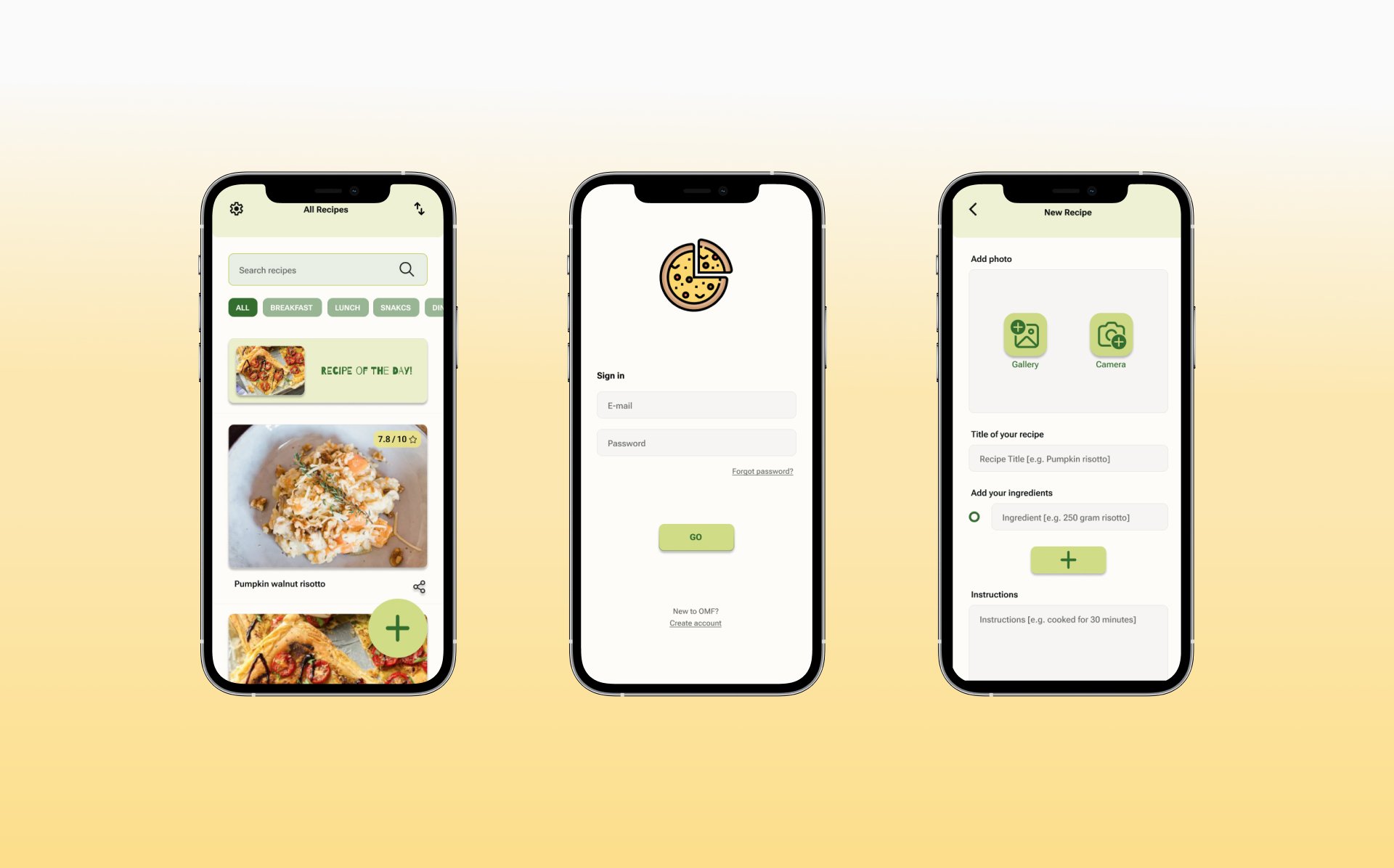
Finally a prototype for a minimum viable product was created as experimental project to practice all skills part of the design thinking methodology. There is still a lot of room for improvement, however as learning by doing is one of the best ways to improve skills, I am happy with this next step into the UI / UX industry. In this prototype recipes can be created and shared, unfortunately the personalized templated are not included yet, however it would set a foundation for further testing. The hardest part was as well to gain direct information for the target user with limited timeframe and budget. On the other hand, this pushed me into creative thinking to gain a solution to obtain the necessary information as best as possible. It is a continuous journey of exploring and improving.
JIBES UI UX DESIGN
This case study is created and executed by Janice Ibe. Someone who is ambitious and creative, often inspired by elements of nature and adventure. Would you like to know more about the designer or contact details? Click on the button below.


